7 min
longer than competitors. Hotjar recordings showed users pausing, scrolling back
Divvy · Onboarding
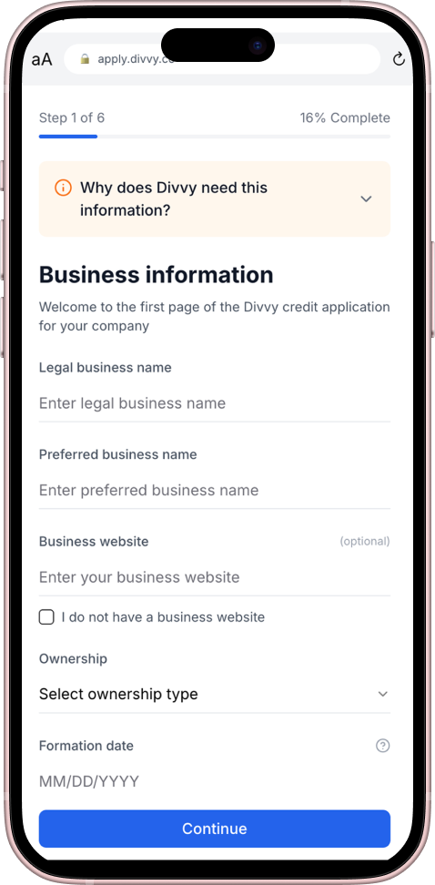
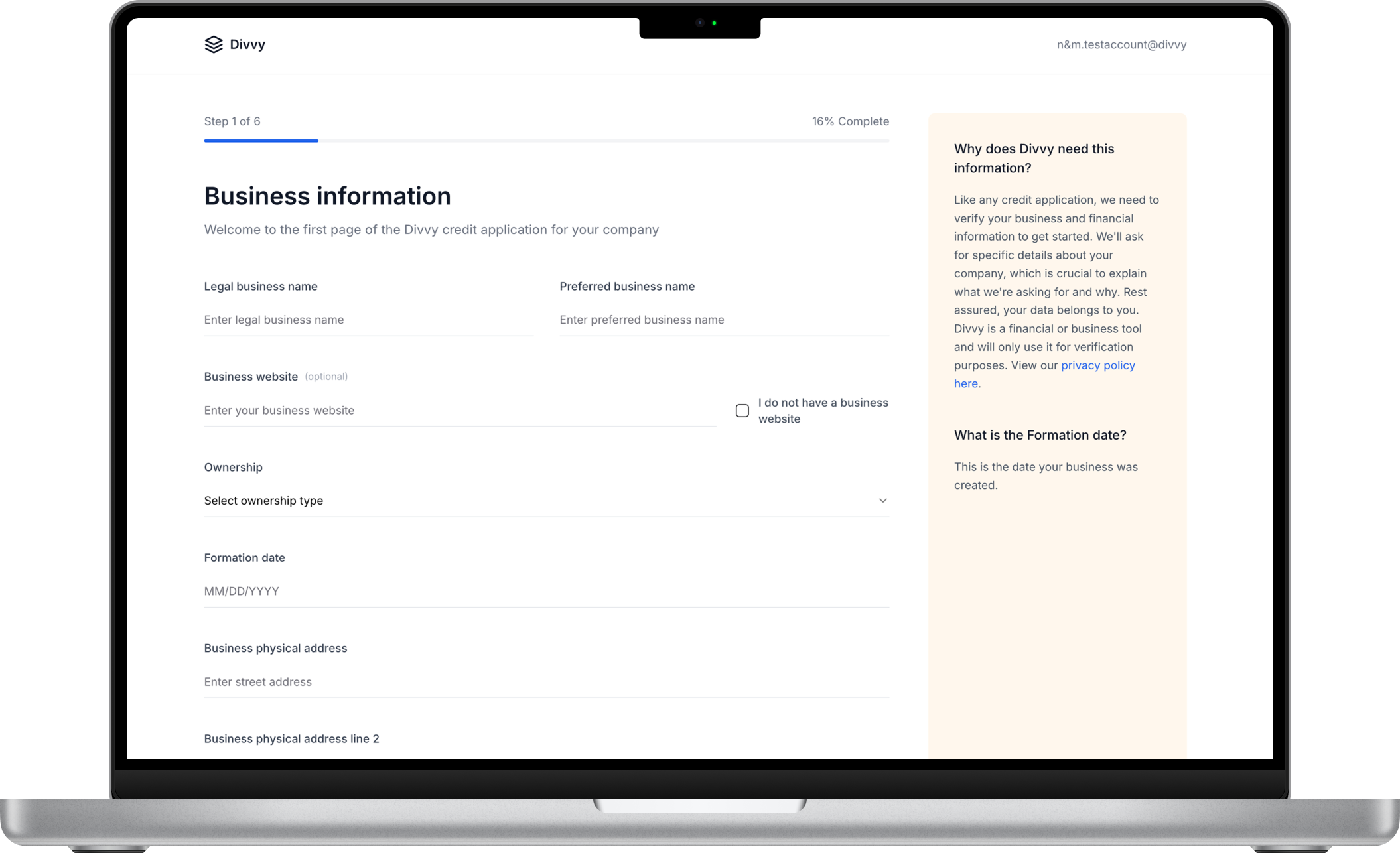
Applicants were leaving Divvy’s card application before submitting it. I redesigned the desktop and mobile flow with clearer steps, visible progress, and guidance to help people understand what to do next.
Key ConstraintI could not change the card approval process or the legal requirements. The flow had to work inside those constraints.
01 · My role
Business context
A critical growth blocker
Divvy's growth team flagged onboarding as the biggest conversion bottleneck. With 10,000+ monthly signups, small gains here moved the number.
Customer success was full of confused users. NPS pointed at onboarding. The executive team made it a Q1 priority.
02 · The problem
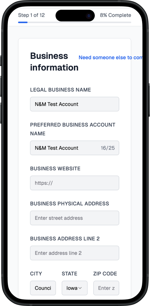
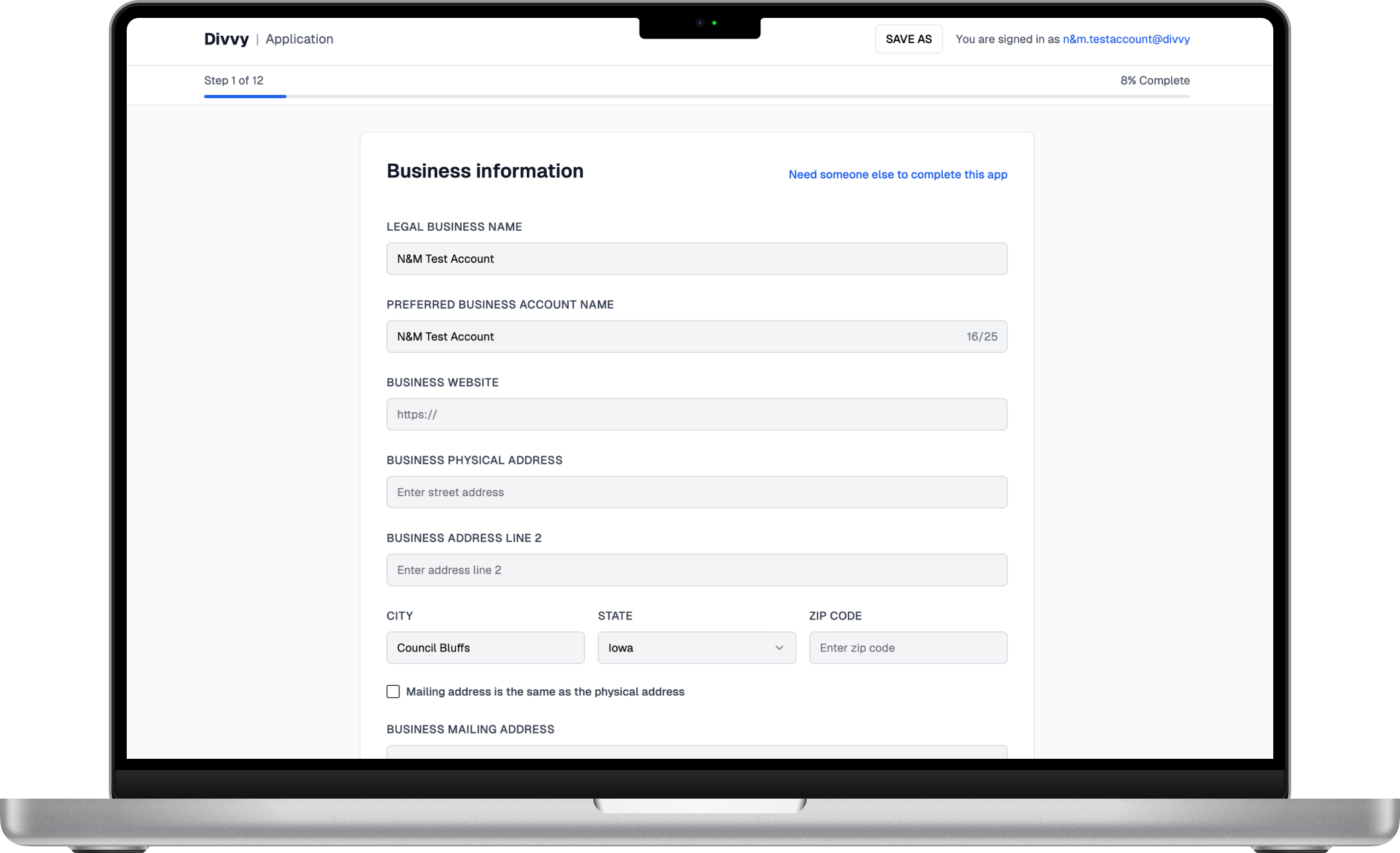
Step 1 of 12 - Before: Overwhelming form fields, mobile not optimized. After: Clearer flow, better layout, and reduced support tickets.
47% drop-off rate
73% support tickets
$2.4M potential ARR lost
03 · Research insights
longer than competitors. Hotjar recordings showed users pausing, scrolling back
drop-off at step 3. Card selection caused the most confusion
support tickets about onboarding. "I'm not sure if this is right for me"
04 · Design principles
Make progress clear and expectations obvious at every moment
Provide options without overwhelming. Guide, don't dictate
Optimize for the smallest screen, enhance for larger ones
05 · New experience
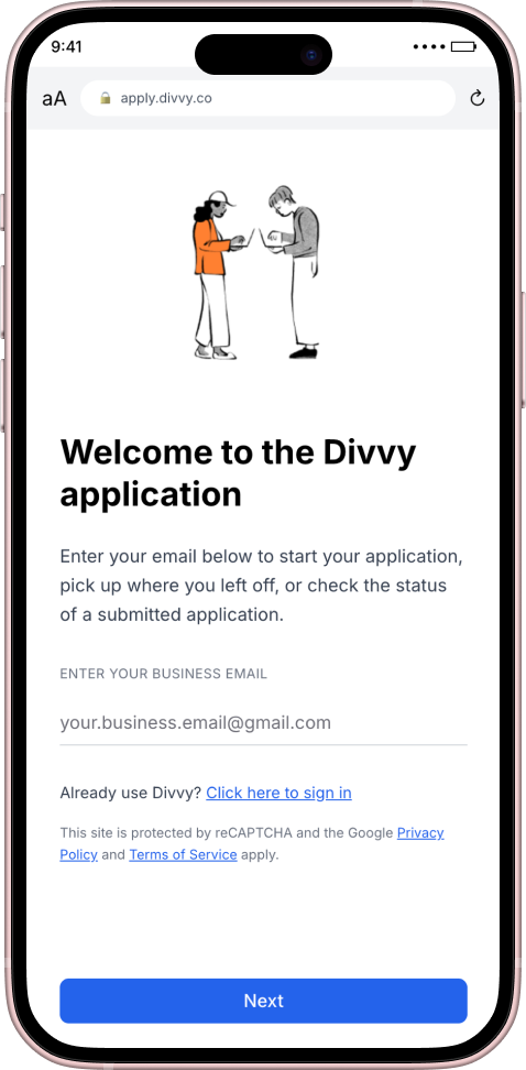
Step 1
Welcome
Simple email entry with clear next steps
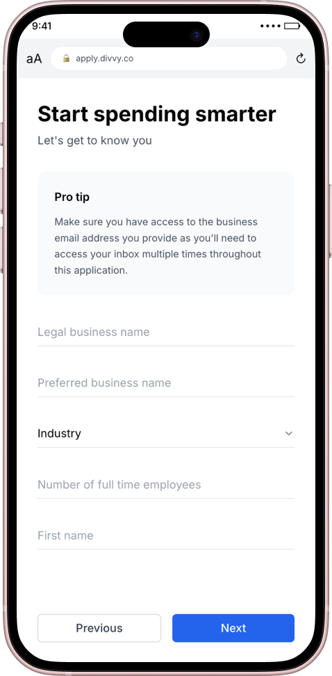
Step 2
Business Info
Helpful tips guide users through the process
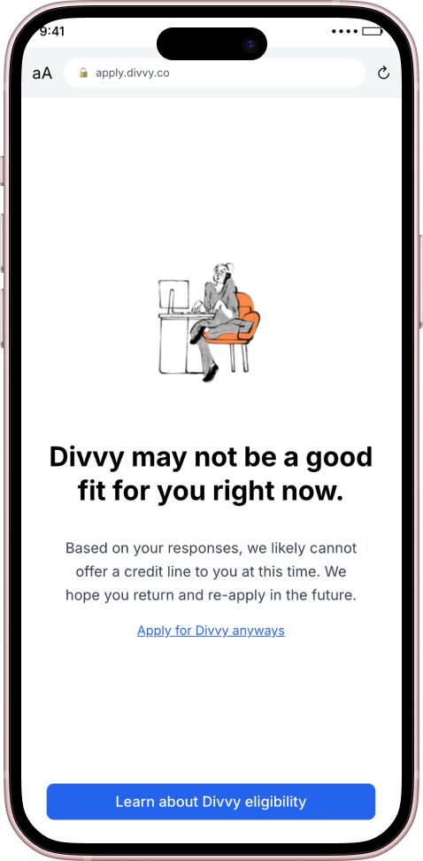
Step 3
Transparent Results
Clear messaging with alternative options
New experience
A shorter flow with progress you can see
06 · Impact
From 53% to 89%
Customer success team relief
Up from 62%
From improved conversion
07 · Reflection
I was not chasing fewer clicks. I wanted people to feel sure at the moment they apply. Every change came from real friction, got tested, and had to flex for later card types.
Onboarding is where trust is built or broken. I treated it as the product, not a form to get through. Completion went up, and the patterns later showed up in other signup flows.
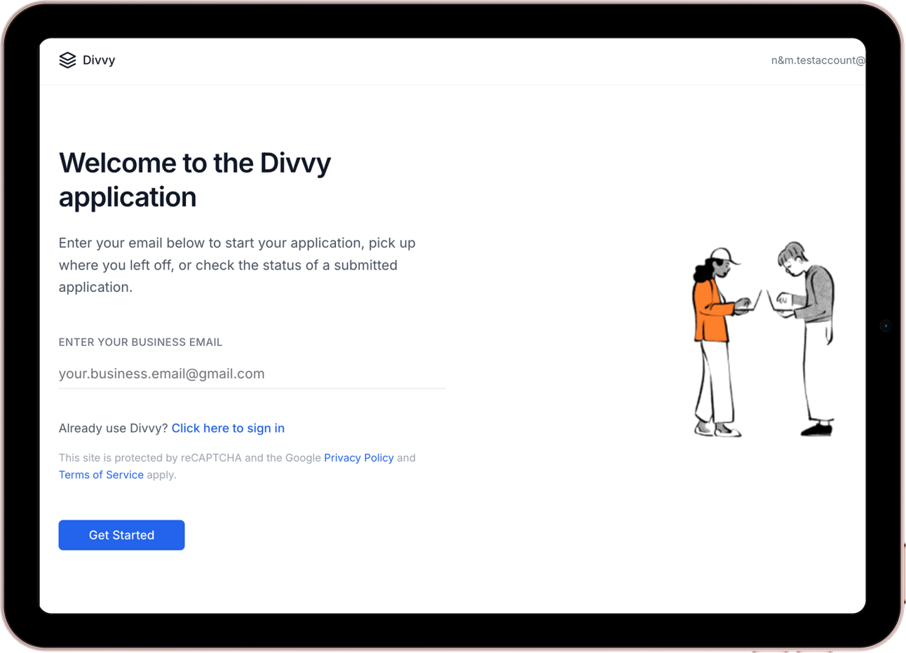
Framework Impact
The design system and patterns from this project were adopted across 3 additional signup flows, creating consistency and reducing future design debt.
Beta user feedback
This is the first time I actually wanted to finish applying.